Google Pie Chart
I will show data on Google pie chart using Python Flask API. I will show some static data on Google chart API using Flask web application. The data are built in a dictionary format using Python API and I will display data on chart by rendering the Flask template.
Pie charts are generally used to show percentage or proportional data and usually the percentage represented by each category is provided next to the corresponding slice of pie.
Prerequisites
Python 3.7.4/3.11.5, Flask 1.1.1/2.3.x, Google Pie Chart API
Project Directory
First step is to create a project root directory under which I will put all the required files for the project.
Let’s say I am going to create a project root directory pie-chart.
I may not mention the project root directory in subsequent sections and I will assume that I am talking with respect to the project’s root directory.
Configuring Flask
Create the below app.py script(py is the extension to indicate Python script) where I import the flask module. This file should be created under the project root directory. Notice how I create flask instance.
from flask import Flask

app = Flask(__name__)
Configuring URLs
Next I will create main.py script that will define the URI and render a template file for displaying data on Google pie chart.
Ideally the data should come from database or any other source and a chart should be generated based on real data. But for example purpose, here I am hard-coding the data to be displayed on pie chart.
I use http method GET for displaying view. By default http method is GET if you do not specify http method.
I use render_template function from flask to show the view. I pass the data as an argument to the render_template function.
from app import app
from flask import jsonify, request, render_template
@app.route('/google-charts/pie-chart')
def google_pie_chart():
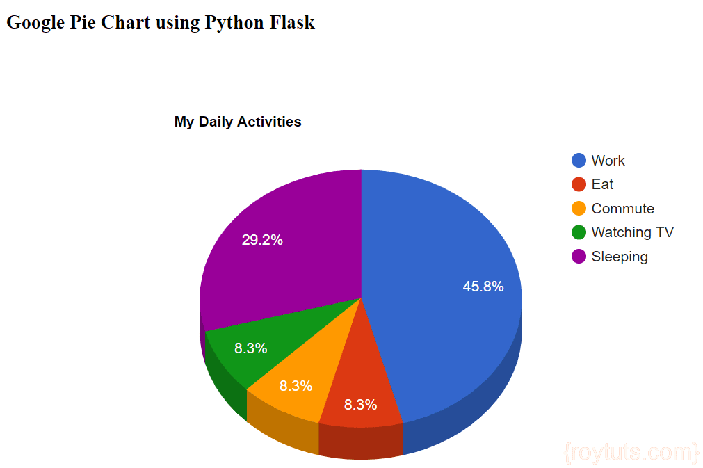
data = {'Task' : 'Hours per Day', 'Work' : 11, 'Eat' : 2, 'Commute' : 2, 'Watching TV' : 2, 'Sleeping' : 7}
#print(data)
return render_template('pie-chart.html', data=data)
if __name__ == "__main__":
app.run()View – Template File
Create a templates directory under the project’s root directory and create a template file pie-chart.html with the below content.
Now I will add Google chart API to display our data on chart. I will iterate dictionary items to build the pie chart.
I am also checking whether data is string or not. If the data type is string then I quote around it otherwise I simply put the integer value.
I configure chart options using options array with title and whether the pie chart should be rendered as 3D (is3D = true) or not (is3D = false) . By default pie chart is not rendered as 3D (is3D = false) .
<!DOCTYPE html>
<html>
<head>
	<meta charset="UTF-8">
	<title>Show Data on Google Pie Chart using Python Flask</title>
	<script type="text/javascript" src="https://www.gstatic.com/charts/loader.js"></script>
    <script type="text/javascript">
      google.charts.load("current", {packages:["corechart"]});
      google.charts.setOnLoadCallback(drawChart);
      function drawChart() {
        var data = google.visualization.arrayToDataTable([
			{% for key, value in data.items() %}
				{% if value is string %}
					['{{ key }}', '{{ value }}'],
				{% else %}
					['{{ key }}', {{ value }}],
				{% endif %}
			{% endfor %}
        ]);

        var options = {
          title: 'My Daily Activities',
          is3D: true,
        };

        var chart = new google.visualization.PieChart(document.getElementById('piechart_3d'));
        chart.draw(data, options);
      }
    </script>
</head>
<body>
	<div style="margin: 10px 0 0 10px;width: 1000px">
		<h3>Show Data on Google Pie Chart using Python Flask</h3>

		<div id="piechart_3d" style="width: 900px; height: 500px;"></div>
	</div>
</body>
</html>
Running and Testing the Pie Chart Application
Now navigate to the project’s root directory and execute the command python main.py as shown in the below image, your server will start on default port 5000.
If you want to change the port then you can change the line app.run() to app.run(port=50001), where 5001 is the new port.
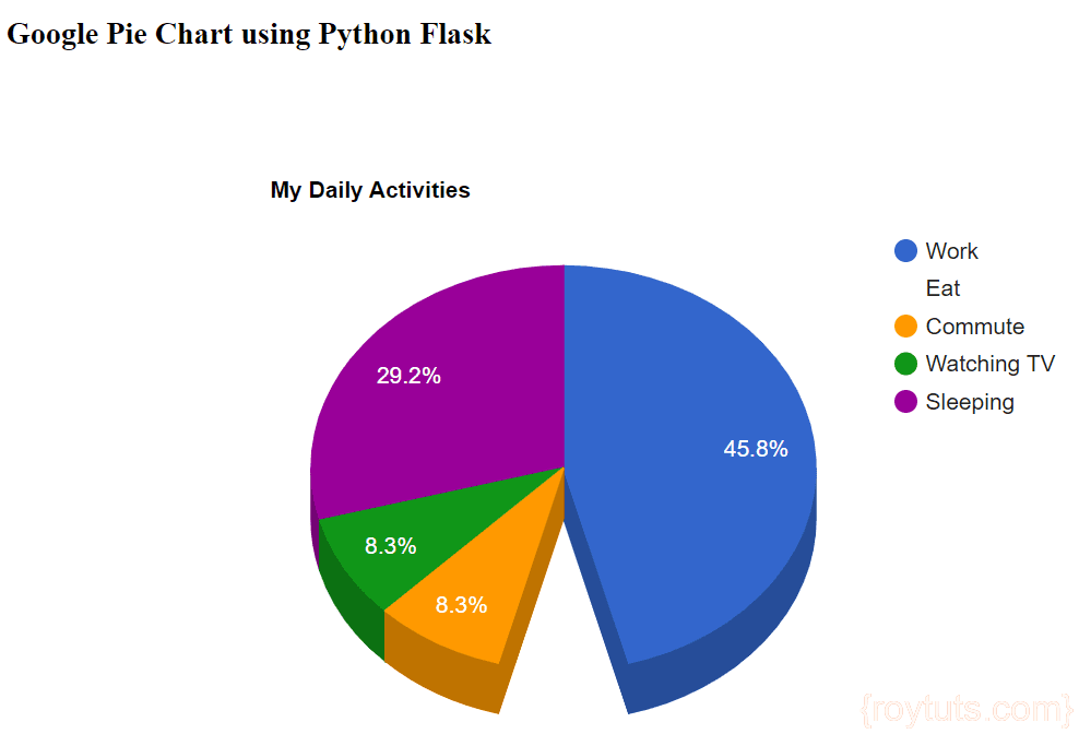
Hit the URL http://localhost:5000/google-charts/pie-chart to open the home page and you will see below output on the page:
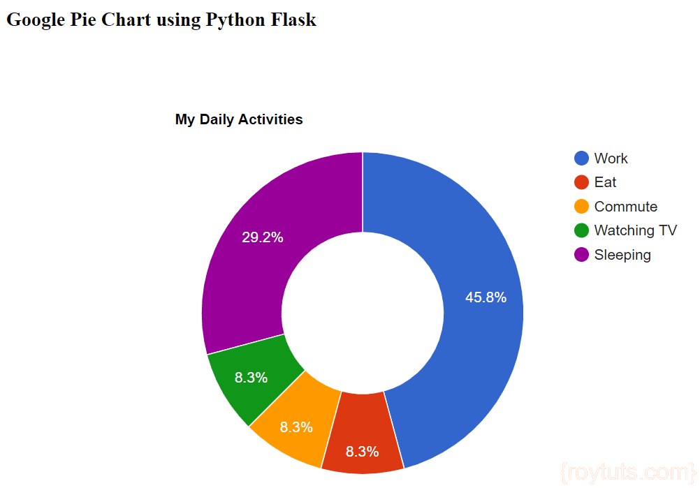
Making Donut Chart
If you want to make donut chart then update options array as follows:
var options = {
  title: 'My Daily Activities',
  pieHole: 0.5
};
Remember you cannot make both
3Danddonut. So you have to choose any one of them and if you do,pieHolewill be ignored.
The pieHole option should be set to a number between 0 and 1, corresponding to the ratio of radii between the hole and the chart. Numbers between 0.4 and 0.6 will look best on most charts. Values equal to or greater than 1 will be ignored, and a value of 0 will completely shut your piehole.
By applying above changes to the pie chart your donut chart will look like the below image:
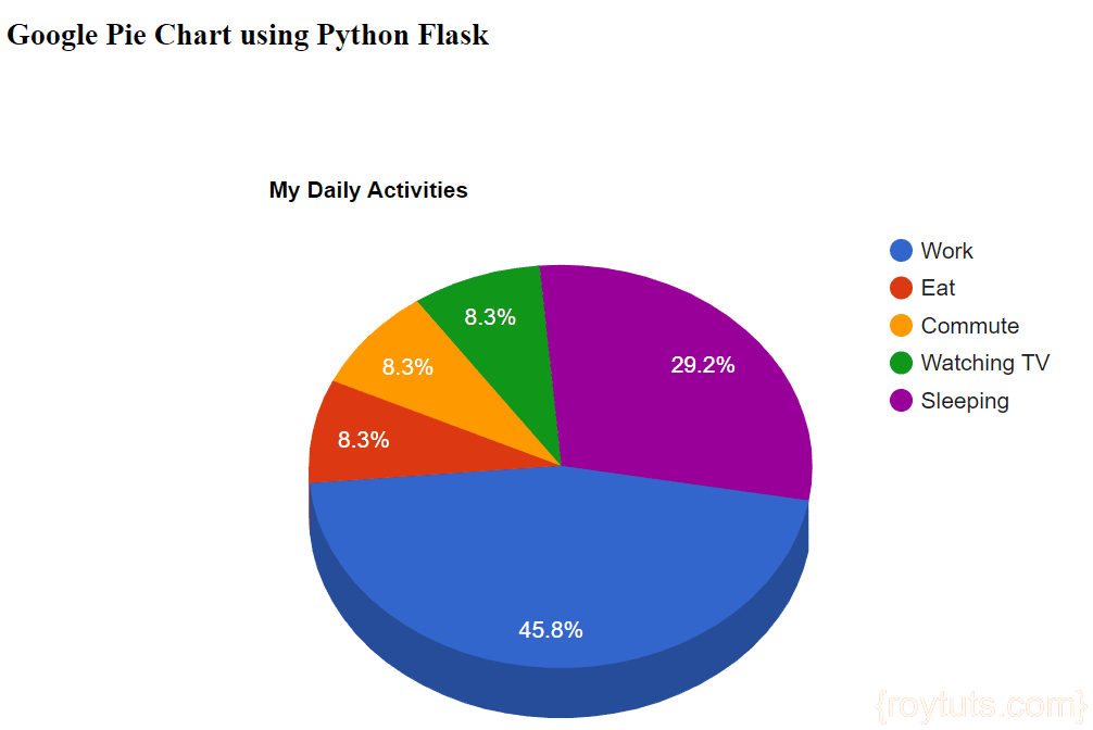
Rotating a Pie Chart
By default, pie charts begin with the left edge of the first slice pointing straight up. You can change that with the pieStartAngle option:
var options = {
  title: 'My Daily Activities',
  is3D: true,
  pieStartAngle: 100
};
Here, I rotate the chart clockwise 100 degrees with an option of pieStartAngle: 100.
Notice you can make the chart 3D while you rotate.
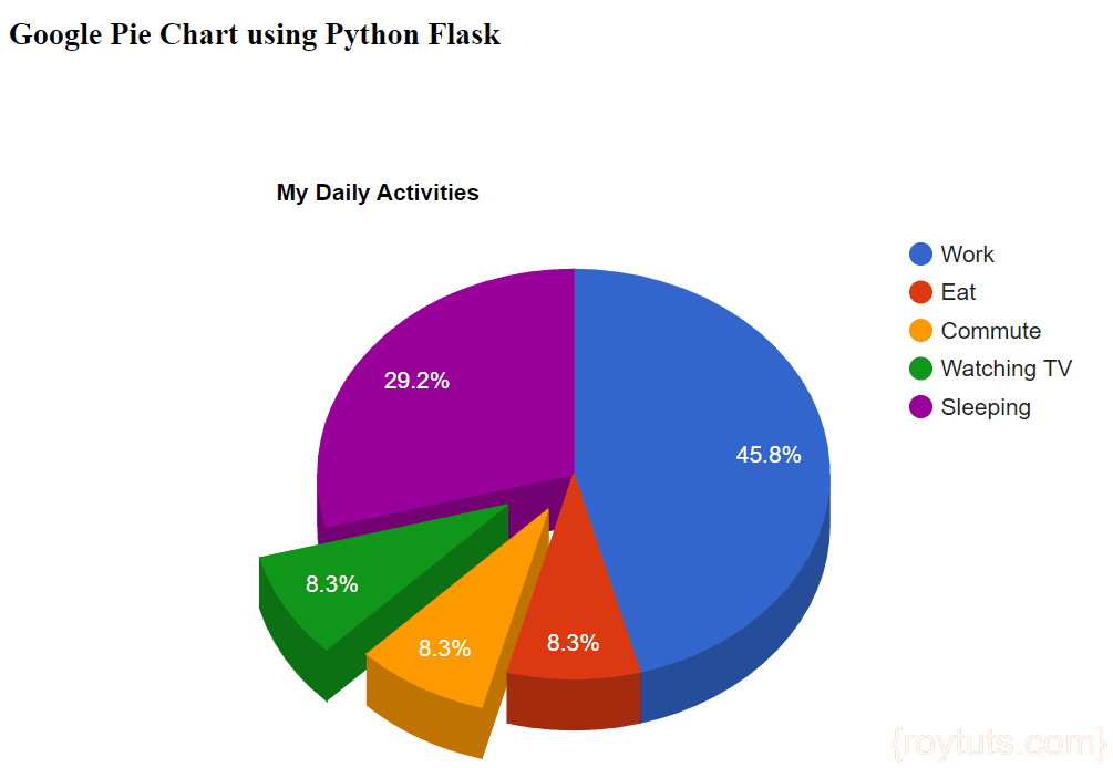
Exploding a Slice
You can separate pie slices from the rest of the chart with the offset property of the slicesoption:
var options = {
  title: 'My Daily Activities',
  is3D: true,
  slices: {
	2: {offset: 0.2},
	3: {offset: 0.3}
  }
};
Your chart output will be similar to the below image:
Removing Slices
To omit a slice, change the color to 'transparent':
var options = {
  title: 'My Daily Activities',
  is3D: true,
  slices: {
	1: { color: 'transparent' }
  }
};
I have removed the slice number 1 from the above pie chart.
If ‘-Apostrophe is in the data, that is replace by ‘'’ How I can Fix?
Thank you for publishing this, I truly don’t understand why google made it so difficult to get data into their chart service dynamically..